UI/UX Design
Pet Door Site Mockup
Freedom Pet Pass
- UI/UX
- Figma

Project Introduction
One of my first larger-scale projects working with Figma was for a rebrand and site redesign for SHIELD Pet Doors. Their old Wordpress theme was quickly falling behind in effectiveness and clarity, plus with the looming rebrand hanging over their heads, none of their products would match what the site was displaying.
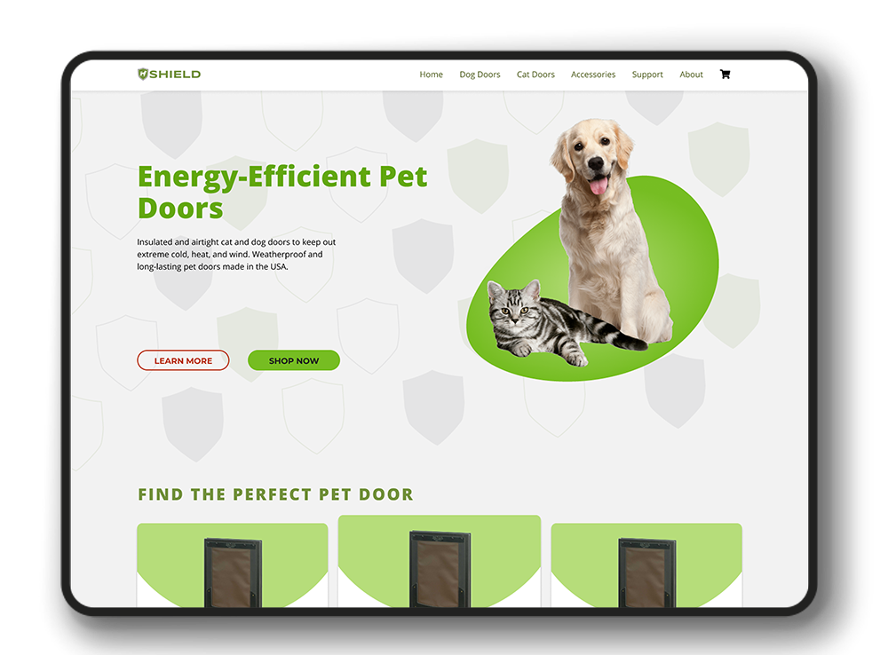
I was asked to provide a mockup of a redesigned website using SHIELD's new branding, logo, color scheme, etc. The mockup didn't have to stray very far from the layout already being used, but it should better fit the rebrand, plus I was given the okay to make other changes that I felt would work to the site's benefit.
First, a Review
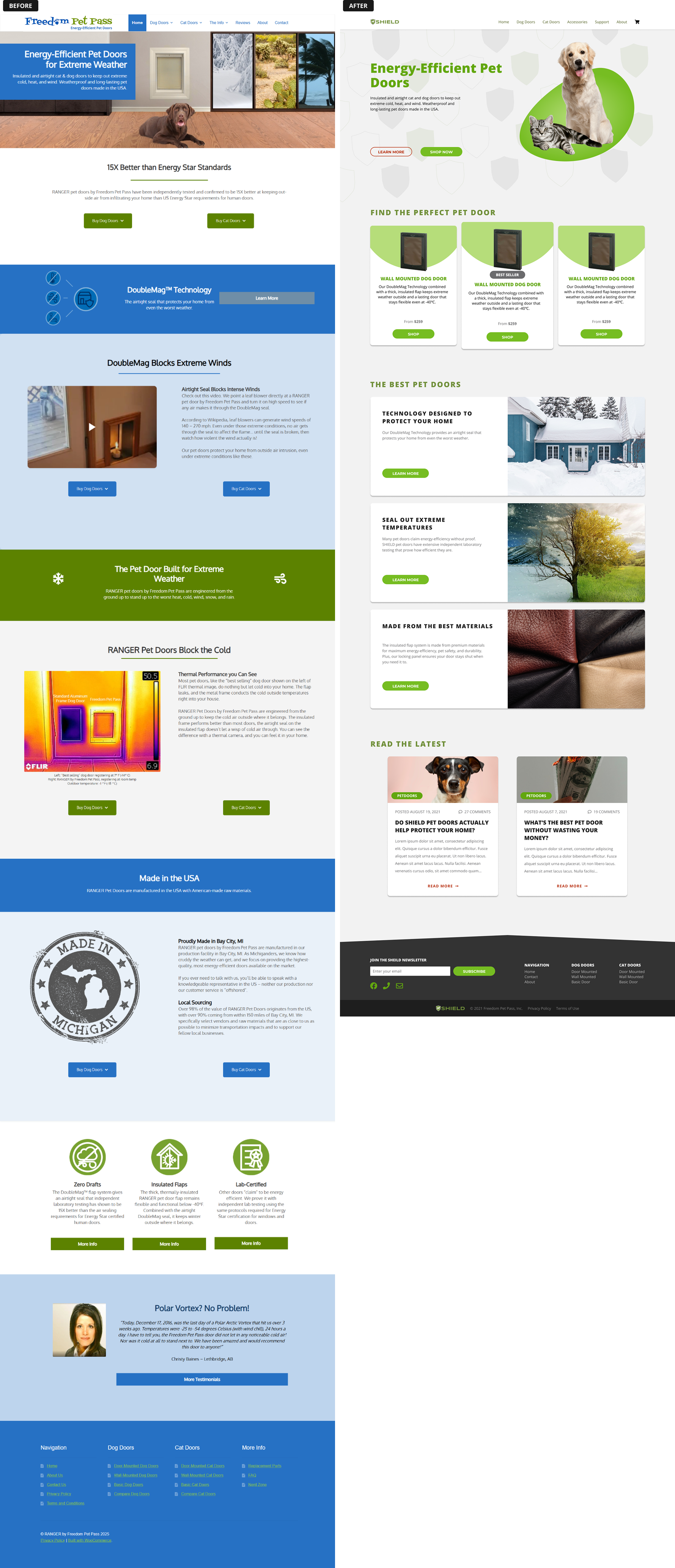
Before diving into a design, I first took some time to examine the old site and get a feel for it's layout, content, and flow. I made sure to note things that I knew could use some support or a rework, and I would keep layouts that already worked well.
I don't want to hark on a Wordpress template too much, since they can be very useful when you need to quickly put a site together, but after implementing a lot of changes without any sort of design cohesion, the ease-of-use can quickly overcomplicate and confuse users who use your site.
Color and Contrast
Color and contrast are among the most necessary components to get right when designing a website. Too much color and your content is distracting. Not enough contrast and elements are blurred together. This site struggles with both on several pages.
The Footer
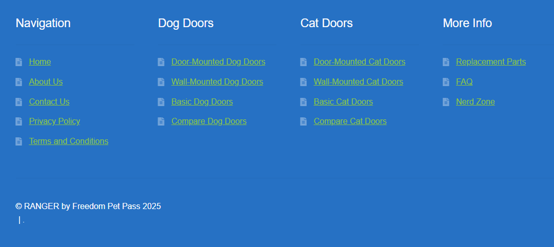
Footers provide essential, often legal or informational, content to users, and to facilitate further interaction with the site, with elements like copyright notices, privacy policies, navigation links, and contact information. The old iteration of this does contain these essentials, but with a poor layout and broken elements.

Dark green links, loosely connected, on a dark blue background, is a recipe for readability disaster. The random pipe symbol and period appear to be an additional location for the Privacy Policy and a "Made with WooCommerce" tag that were hidden with CSS. And the FontAwesome icon next to each link is not only repetitive and unnecessary, it's contrast is so low that you can barely make it out. The footer would benefit greatly from a simplification and color refresh.
The Redesign
For my redesign, I chose a green hue that matches the branding for the primary color, and a complimentary orange - used sparingly - as an additional focal point. Sections were separated not by color, but by spacing. Using whitespace appropriately can significantly improve a design's readability by giving elements room to breath. And by keeping the background a flat gray, important components stand out better.
Homepage

I removed a bit of homepage content that was found on other pages, such as the product pages, and narrowed the focus to just 3 key areas: Popular Products, Product Information, Customer Engagement (Blog).
I wanted to show off the three most commonly purchased products so customers have quick access to the store, highlight some of the doors best features, and showcase recent articles written by the staff to help drive engagement.
Product Page

The product page features a beautifully designed product selection screen, with all the necessary options to choose the perfect pet door. Below that, is product information common across all their pet doors. If you didn't have enough information about the doors before-hand, you do now. And if you needed technical information, you'll see that here too. You can never be too careful to order an appropriately sized door! Testimonials and reviews are all too important here as well. Getting to see feedback, both positive and negative, before buying a product is key to excellent customer satisfaction.
Reflection
Overall, I'm incredibly satisfied with my first large-scale project in Figma. There are some things I would change if I had to do it all over again, though. Firstly, I very rarely used components throughout the design, so making design changes were more tedious than I would prefer. Secondly, some of the colors weren't consistent. I could have used a better color library to ensure better accuracy and consistency between elements. And lastly, I re-introduced some contrast issues with poor spacing and color separation. It's still a much needed improvement over the old site.
Conclusion
Ultimately, my client was satisfied with the mockup and it was used as inspiration for a full site redesign a few months later.
Source Private
-> Live Demo