Web Development
Online Trading Card Game
Hermitcraft TCG Online
- Typescript
- React
- Redux
- SCSS
- Git
- GitHub
- Figma
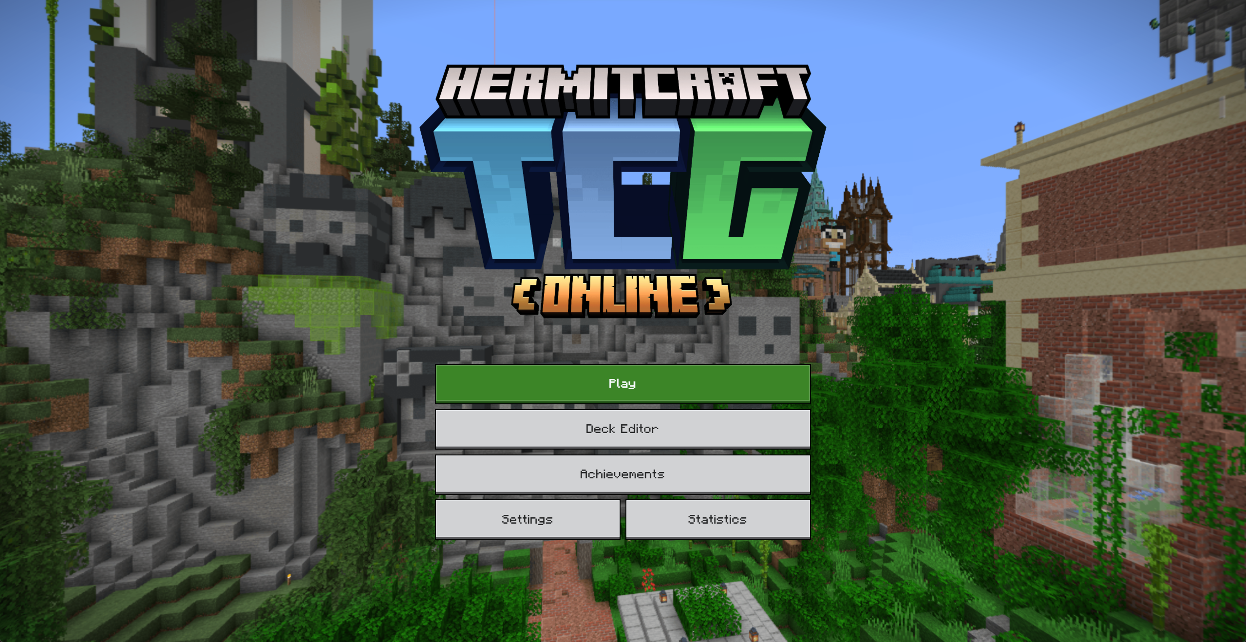
Welcome to Hermitcraft
I’ve been playing Minecraft since the game came out in 2011. The sense of possibility and creativity has capture me and the minds of millions around the world. A major contributor to Minecraft’s success was the ability for anyone to upload and share their gameplay on YouTube. It’s how I came to love the game, and in fact, making Minecraft videos is something I did myself for a short while.
Over the years, there’s been one group of content creators I’ve enjoyed watching over and over again: Hermitcraft. Started in 2012, Hermitcraft is a private Minecraft server where select content creators collaborate and share their ideas and gameplay. They’re known for their creativity, builds, minigames, and family friendly videos.
During their ninth season, creator VintageBeef had the idea to create a Pokémon-inspired trading card game featuring other members of the server. He spent the majority of the season hand-placing blocks to create “cards” using Minecraft’s in game map making feature. The idea grew and the community embraced the game to the fullest extent. So much so, that the viewers wanted to play the game themselves.
One individual took it to the next level and started a website where anyone could play Hermitcraft TCG online. The code became open source on GitHub and anyone who could contribute was encouraged to do so. I had never contributed to public code at this time, but I thought the opportunity to work on something I loved so much was too great to ignore.
Identifying Key Issues
I joined the discord server for the game, introduced myself, and suggested some ideas to improve the UI and UX for the website. Some of the most glaring issues were the lack of a unified design system, poor screen responsiveness, and buggy interfaces. These were all problems acknowledged by the website’s creator. He excelled at backend development but put little effort into ensuring the front-end worked flawlessly.
Knowing that design is my strong suit, I took notes of the areas of the site that needed the most improvement. There were three main areas of concern that I wanted to focus on:
- The main menu and option screens
- The Deck Editor
- The Game screen
The Reworks
Once all the key issues were identified, I opened Figma and started designing some solutions.
Main Menu
BEFORE
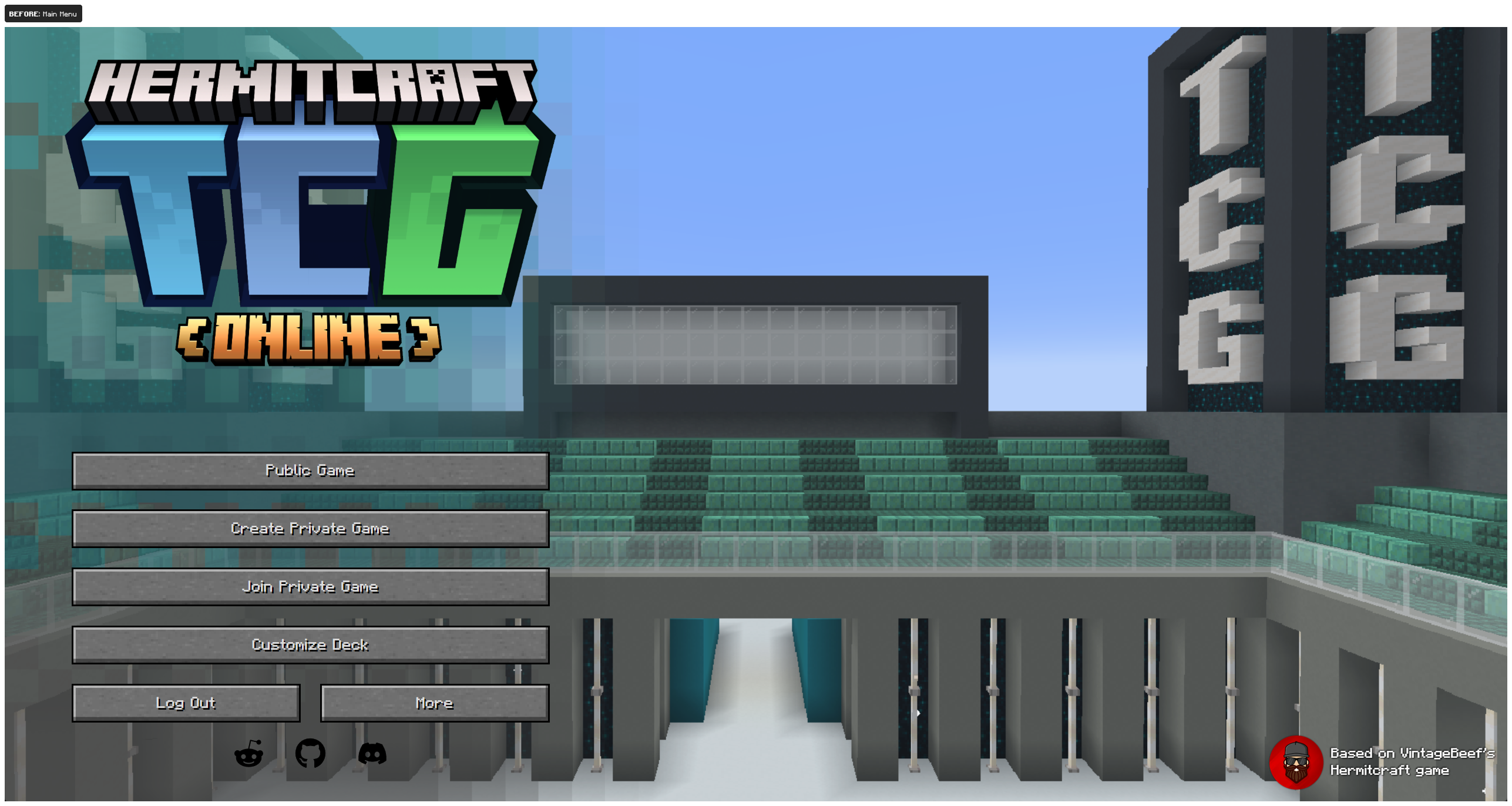
Although not a huge concern, the main menu had some issues I wanted to address. To start, the menu for the game is offset to the far left of the screen, which in and of itself is not a bad design choice, but the implementation here was lacking. The additional icons at the bottom posed some contract issues making readability difficult.
AFTER
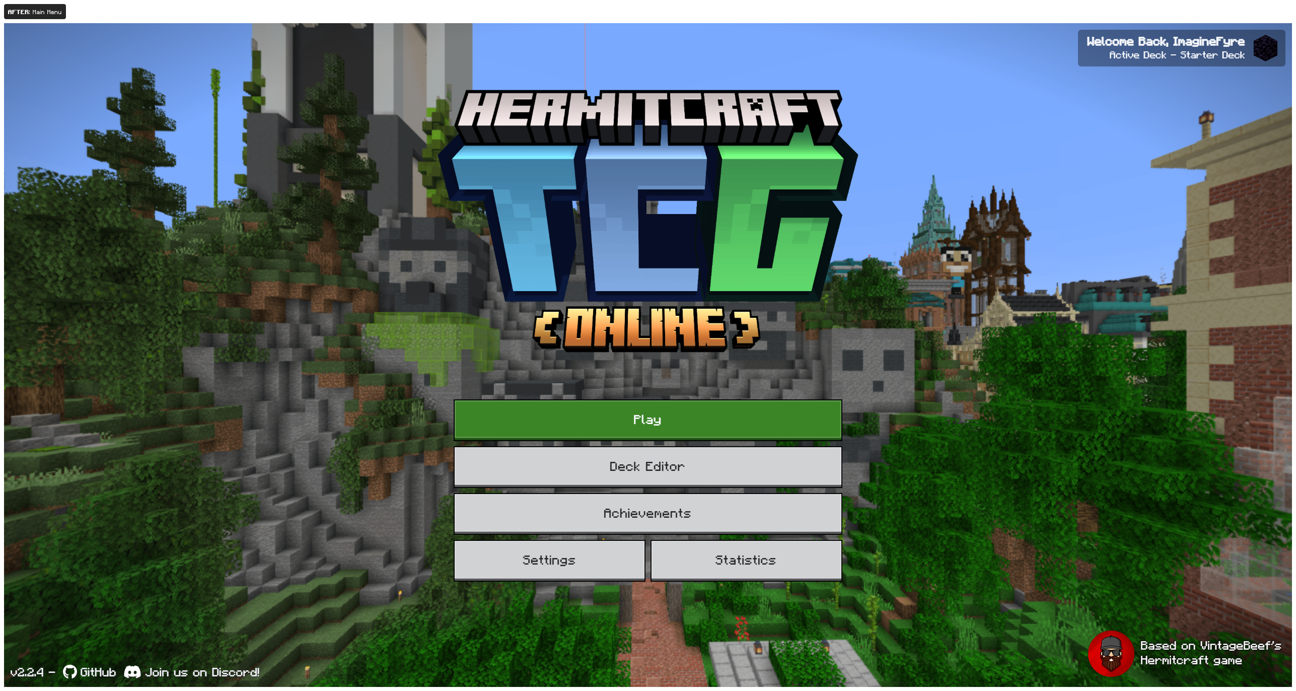
The refreshed main menu now has a centered layout with the design inspired from the actual Minecraft game. The Play button now takes you to a new screen that allows you to select your game mode, rather than having three separate buttons. And the main menu features a panoramic background that slowly rotates around a central location from a previous season of Hermitcraft (also similar to Minecraft's main menu).
Deck Editor
BEFORE
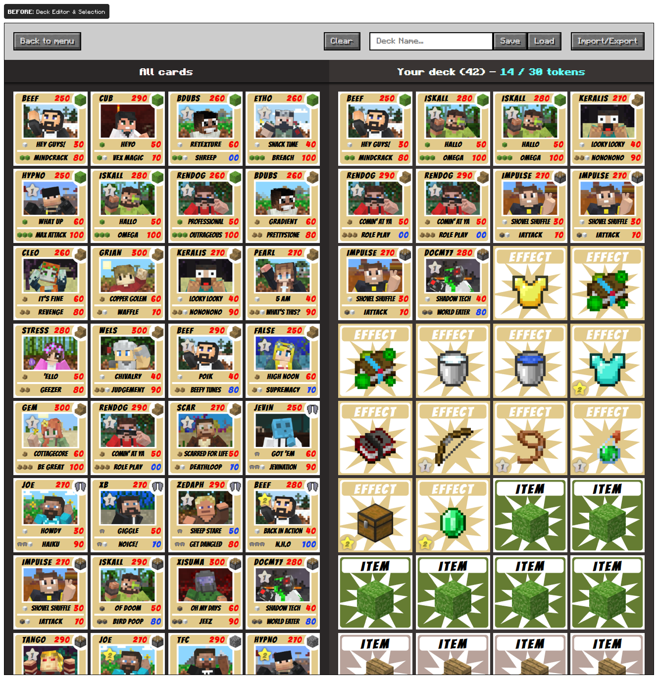
The deck editor is the place players will spend most of their time outside of actual gameplay, so it’s important that everything flows together, both on desktop and on mobile devices. Currently, if you want to edit or create a deck on mobile, you’ll be doing a lot of pinching and zooming around to navigate. Again, the game was designed to work on desktop with very little thought put towards the mobile experience.
Adding and removing cards from your deck was easy enough, but everything else needed a lot of work. Saving a deck was confusing because there was little feedback that your actions were actually being handled. There isn't a list of saved decks, so if you wanted to recall a deck from earlier you would have to remember its name exactly. Searching, organizing, and filtering cards was not an option.
AFTER
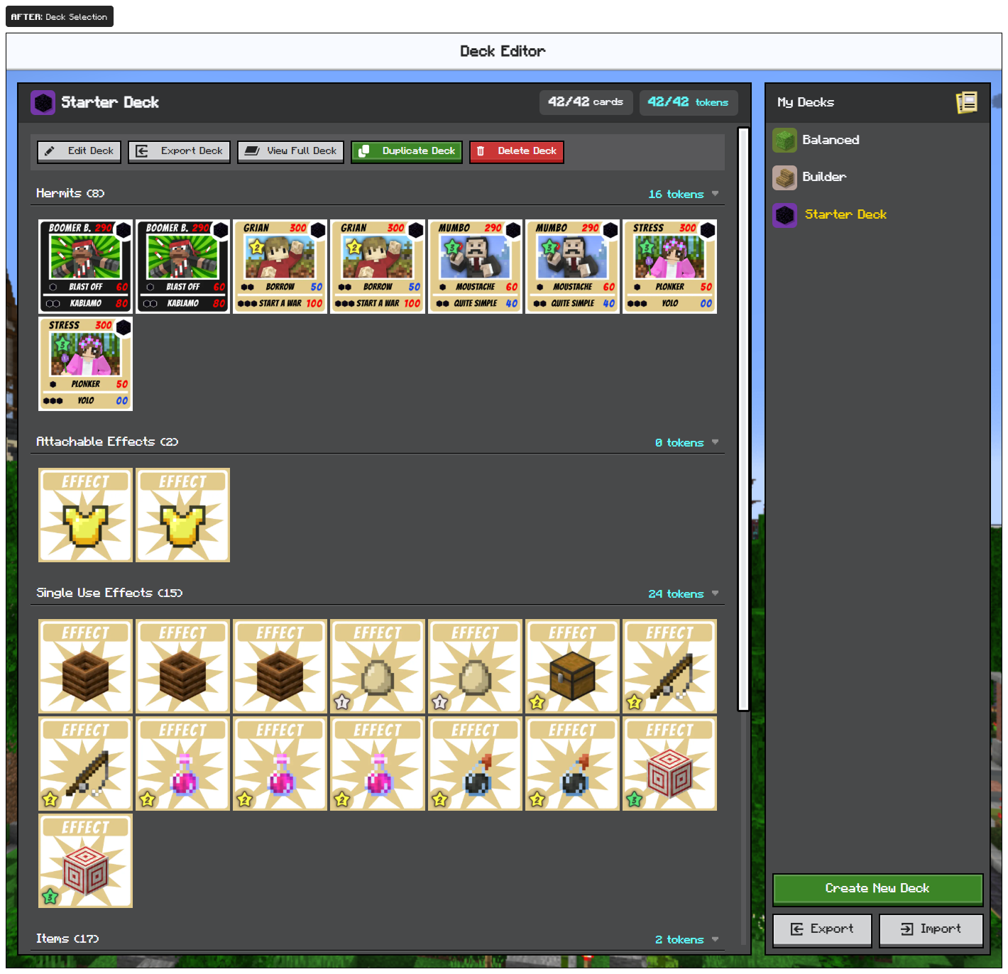
The first UX improvement here was to split the Deck Editor into two key "views". The first being a Deck Selector where you can quickly see all of your decks from the right sidebar. Selecting a deck will show all the cards in the primary view area. From there, you can edit, export, delete, and review all the cards in that particular deck.
Grouping of the cards was also added. Now, everything is grouped into 4 distinct categories based on each of the cards type: Hermits, Attachable Effects, Single Use Effects, and Items.
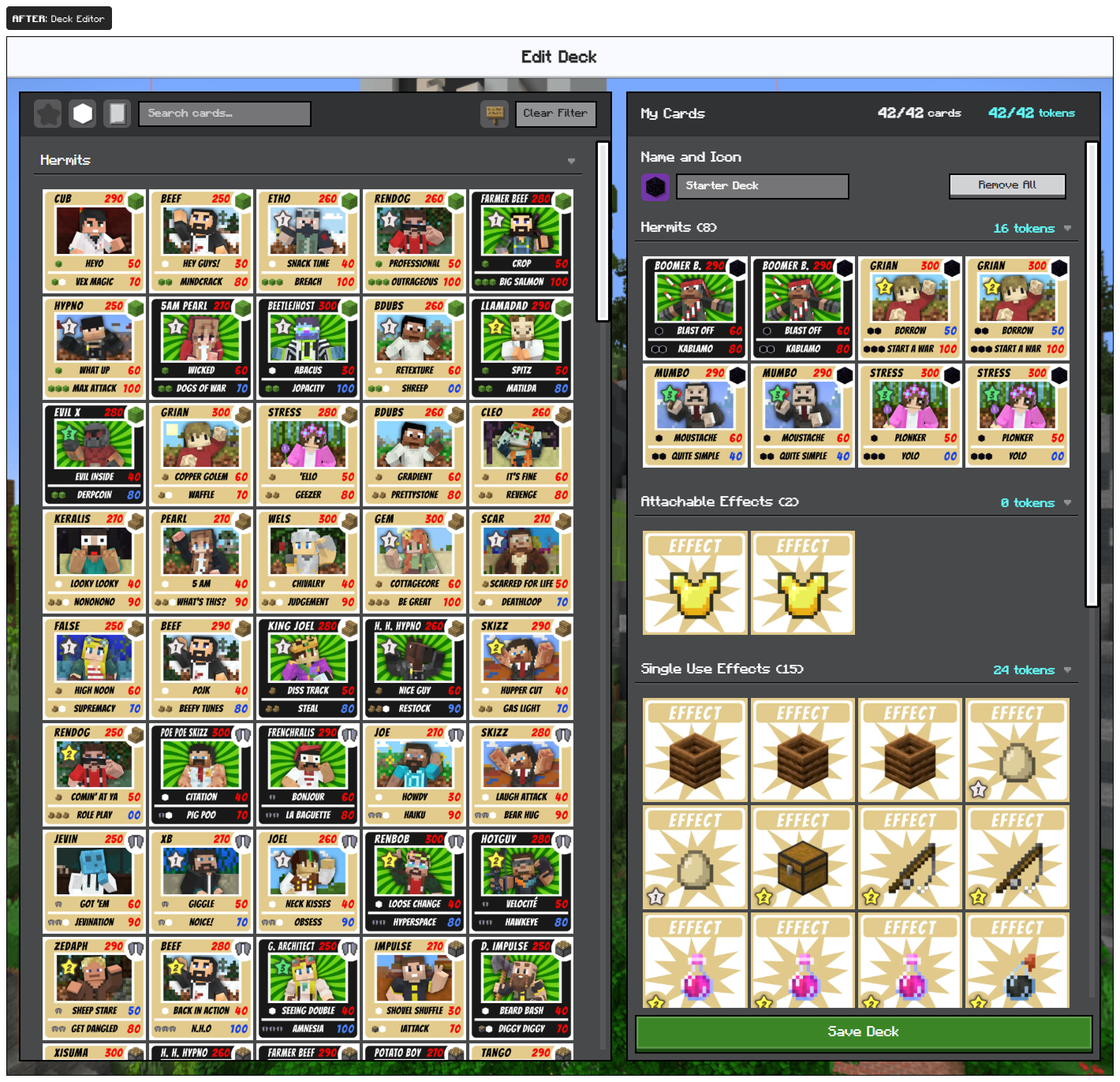
The second view is the actual Deck Editor, which was remade to work better on desktop and mobile. When a user goes to edit or create a new deck, this is where they'll land. Searching for cards was made much easier by adding a text input to filter card names or abilities. Other filters were added to allow users to narrow down their search by cost, rarity, and the set the cards came from. The mobile experience was improved by no longer requiring the use of pinching and zooming to move around the page. Instead, all the cards are presented and you're able to switch back and forth between all cards and your hand.
Game Screen
BEFORE
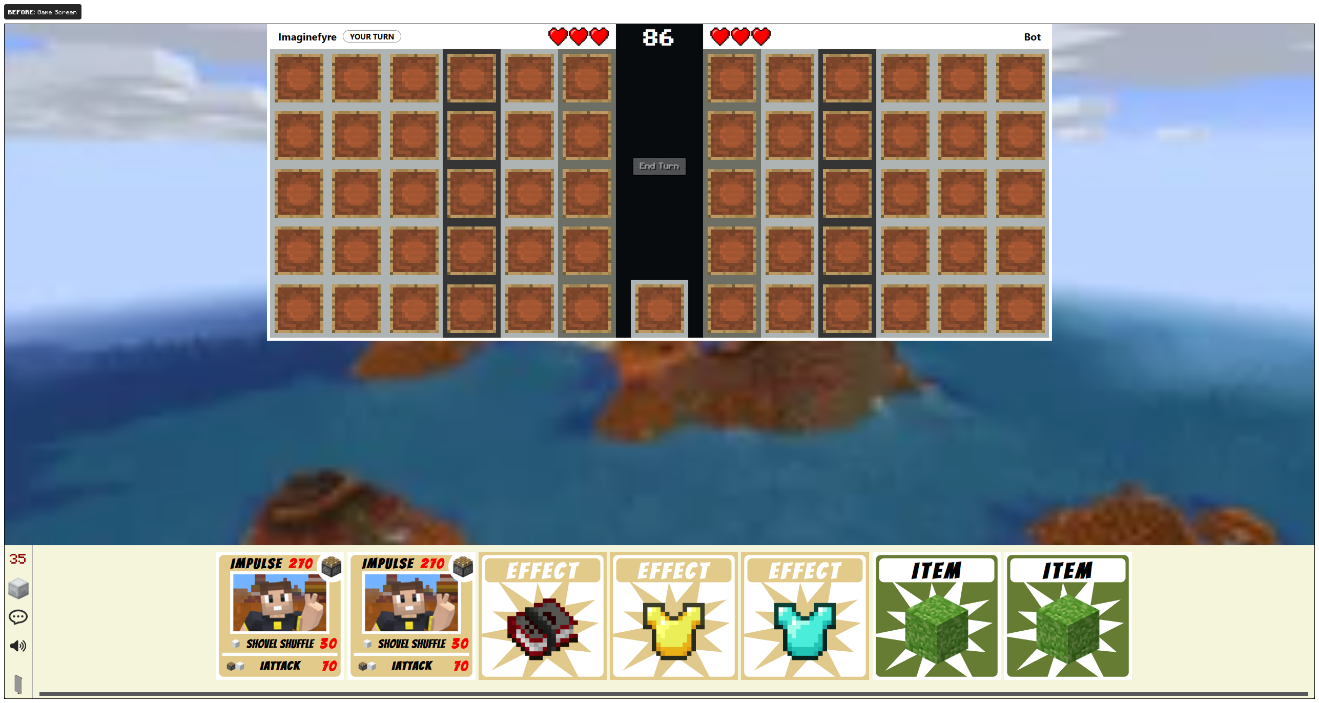
Now for arguably the most important screen. This is, of course, where all our players will be interacting with the cards and playing against other players. The original layout didn't make good use of available screen real-estate and wasn't responsive. Playing on mobile was a nightmare since users couldn't see the entire board, and some devices wouldn't let you scroll over to see your opponents side.
AFTER
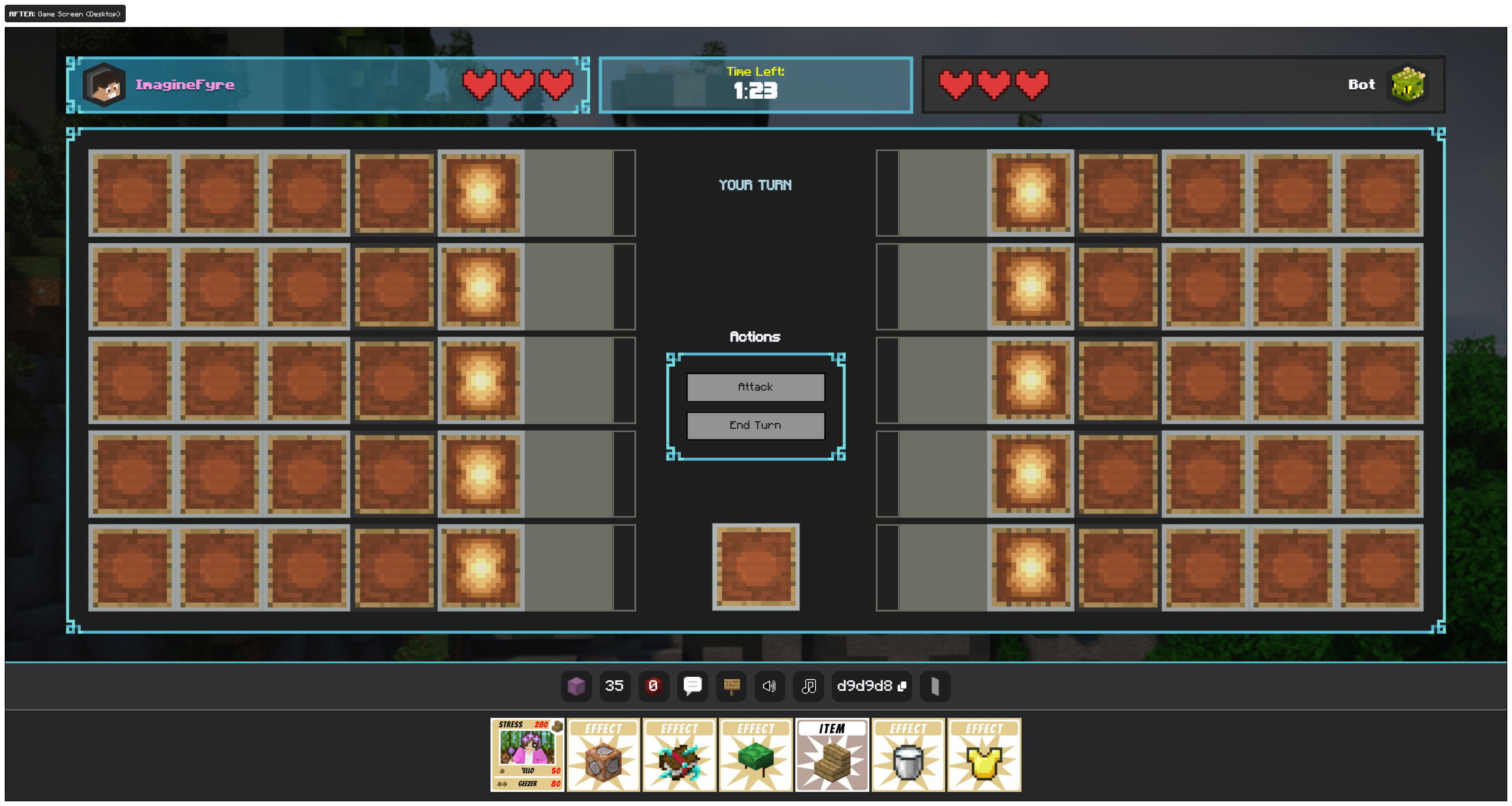
The first step to improving the game board was to make it responsive. No matter what size screen you have, you should be able to play the game. For desktop, that means scaling the game board to match the height or width of your viewport. Additional elements were also added that allowed for further customizability. Name cards, titles, hearts, borders, and more could all be customized for users to personalize their experience.
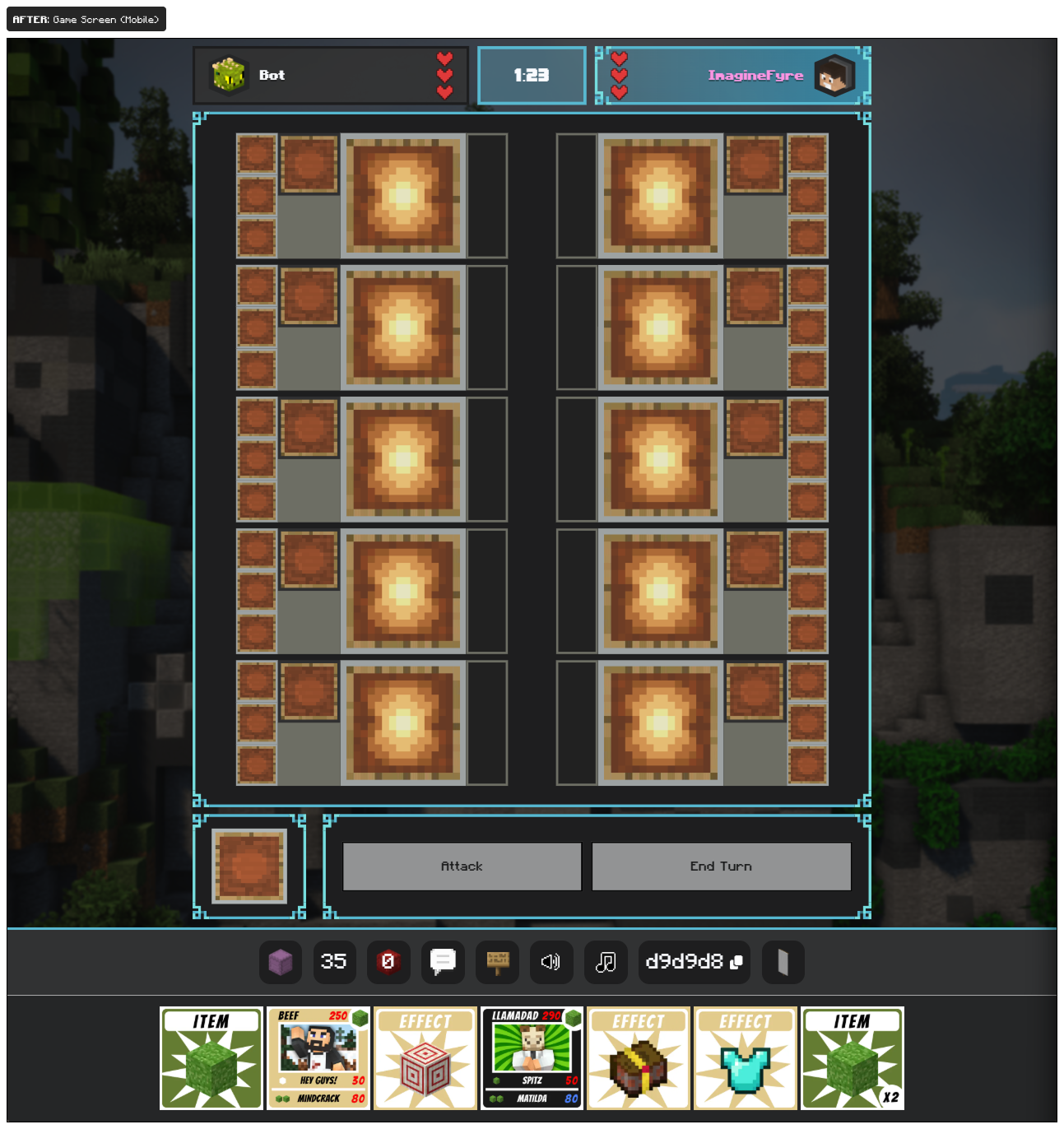
And last, but not least, a quick look at the mobile view of the game board. Since this is just a website, we aren't able to force a specific device orientation. The best way to move forward was to adjust the game board to work for vertical screens. This changes how the board looks, but not how the game works. Everything we did for the desktop experience, also carries over to the mobile experience.
That's a wrap
Working on this project with community members that share a similar love was nothing short of amazing. I worked with some amazing individuals who were very generous to help others. The community as a whole was amazed by the work I did improving the visuals, desktop layouts, and getting the user experience working on mobile. Today, community volunteers continue to improve the game week after week, and the foundation I created is still being built upon for everyone to enjoy.